I haven’t shared our living room much, aside from a really cropped vignette, because I couldn’t wrap my head around a plan of what I wanted to do in the space.
Last week it finally *clicked* for me!
This post is going to take you down memory lane, all the way back to when we first toured our home before purchasing it. I’m pulling out never-before-seen photos from the archives, so buckle up! Plus, there’s another reveal at the very end.
I believe some of my best ideas come when I’m on a deadline because I’m committed to delivering a great result and experience, so I dedicate the time and brain power to figuring out a solution. I’m really really happy with this part of our living room now and am proud to share it with you!

Here’s the photo from when we first saw the home:
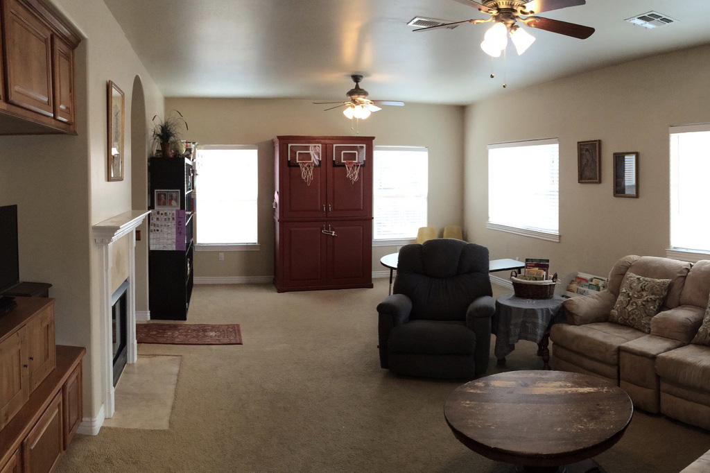
When we moved in eight years ago, we purchased a sectional from Joybird so that we would have seating available when our friends and families came to visit. We picked a color and fabric that was in-stock, with the shortest shipping time, and called it good.
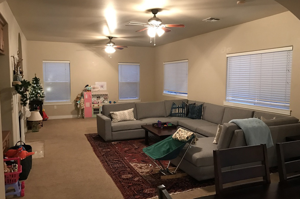
We got the sectional and then I found this massive vintage heriz rug from a dealer in San Diego and brought it back home after vacation. We very obviously had a toddler and lovely beige walls.
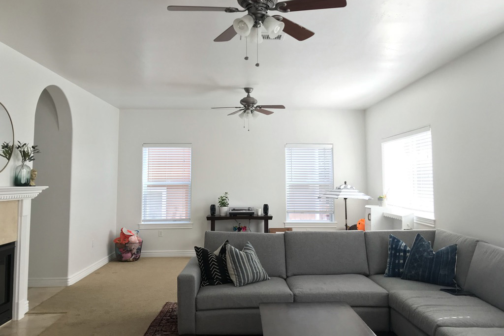
Not long after, we hired painters to give us a clean slate, painting our entire house white (DEW 381). That really helped brighten and freshen up our home. It’s still that same color today.
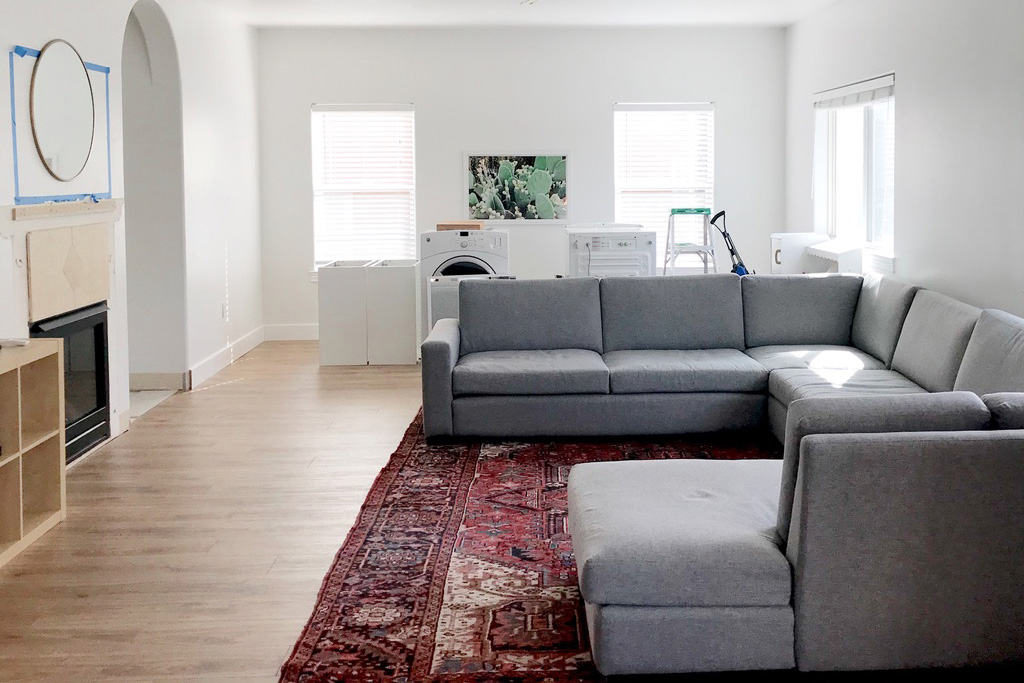
After that, we hired a contractor to replace the carpet on our main level of the home. That felt instantly more modern.
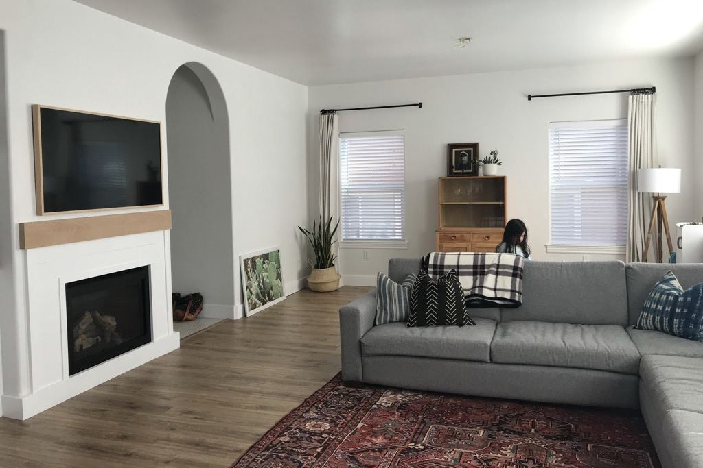
Then you can see I started trying to style the space. I asked Brandon to hang curtain rods and tried heaps on heaps of curtain panels. This was before I started to DIY anything myself.
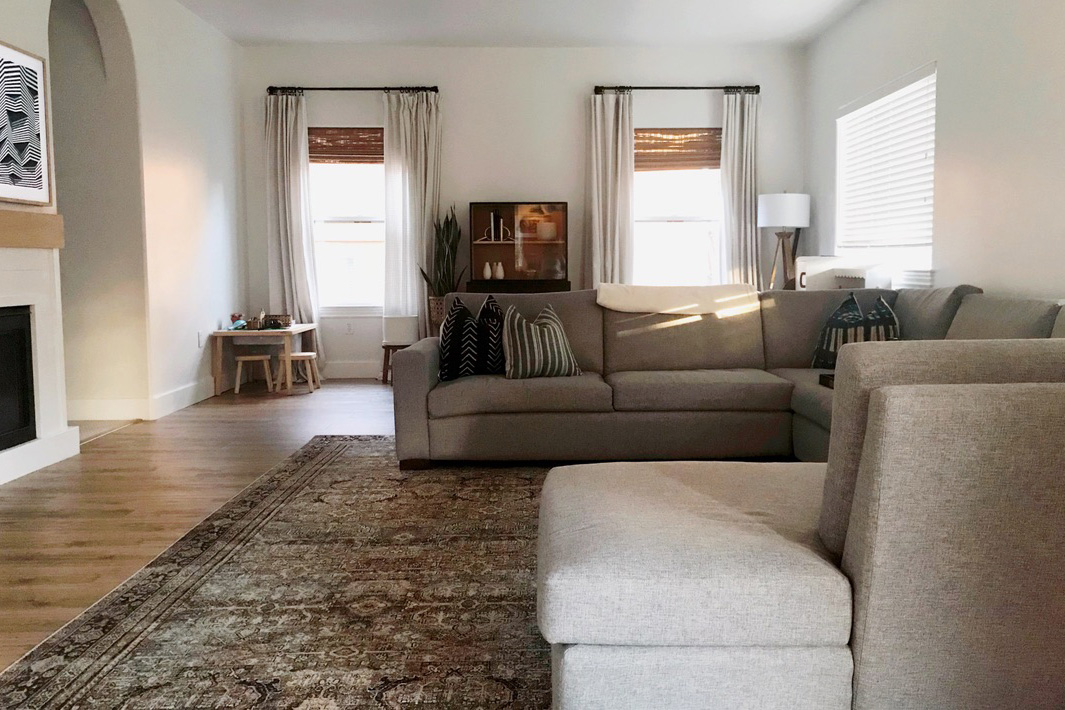
Added bamboo roman shades because every inspo photo I found and saved had them. Stained that cabinet black. Got a new rug. Hi, Layla 😉
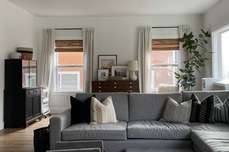
Found another vintage cabinet and tried to do something else here but it felt too boxed and heavy. Look at my audrey ficus in the corner, though! She was so happy then.
For the next several years, that space took on different forms of a play area for the kids, and honestly, a place to hide all of the clutter behind the sofa. I swapped curtain panels several times, but never quite achieved the look I was going for.
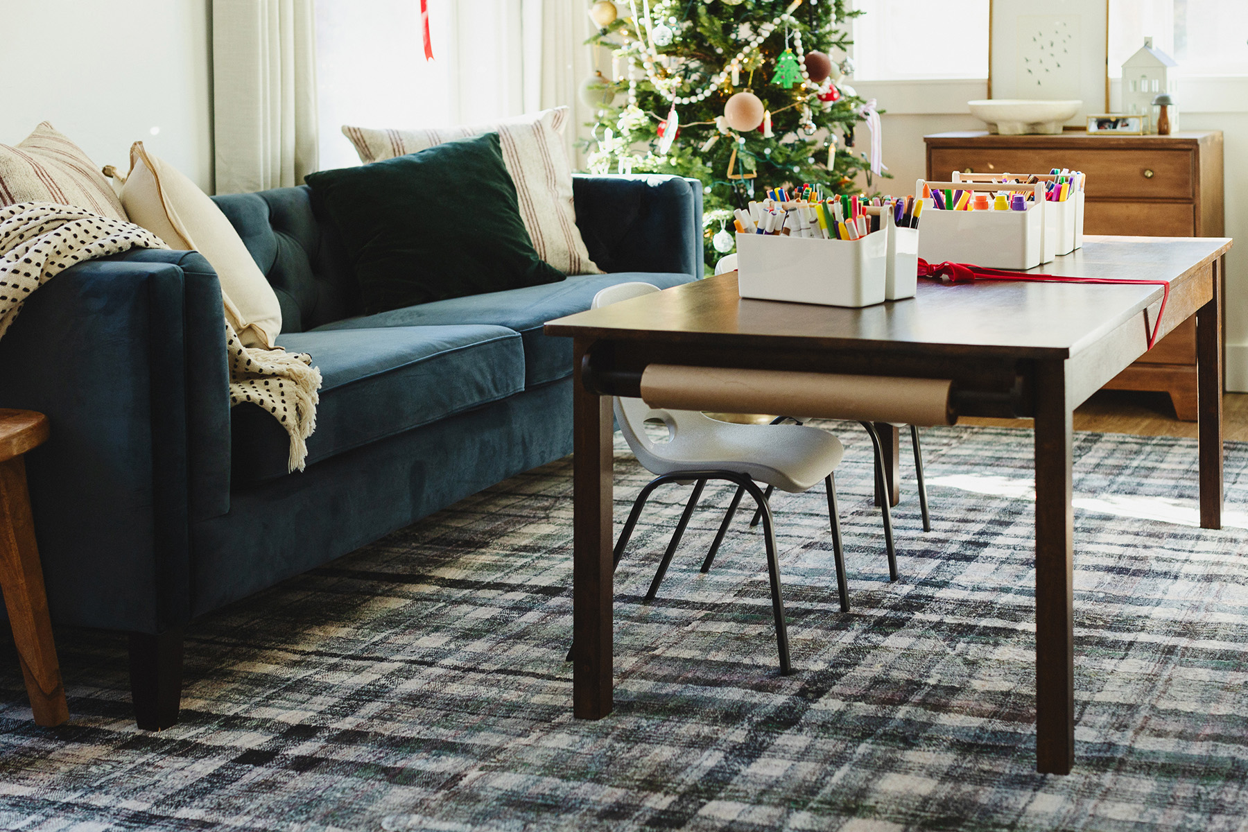
Late last year I partnered with a brand to share this rug and found this kids craft table on FBMP. I styled this scene over the holidays for that campaign. I loved that my kids had a dedicated space for all of their art supplies and the fact that they used this space, a lot.
They used it so much that I found pieces of clay stuck to the rug, which meant the rug had to go.
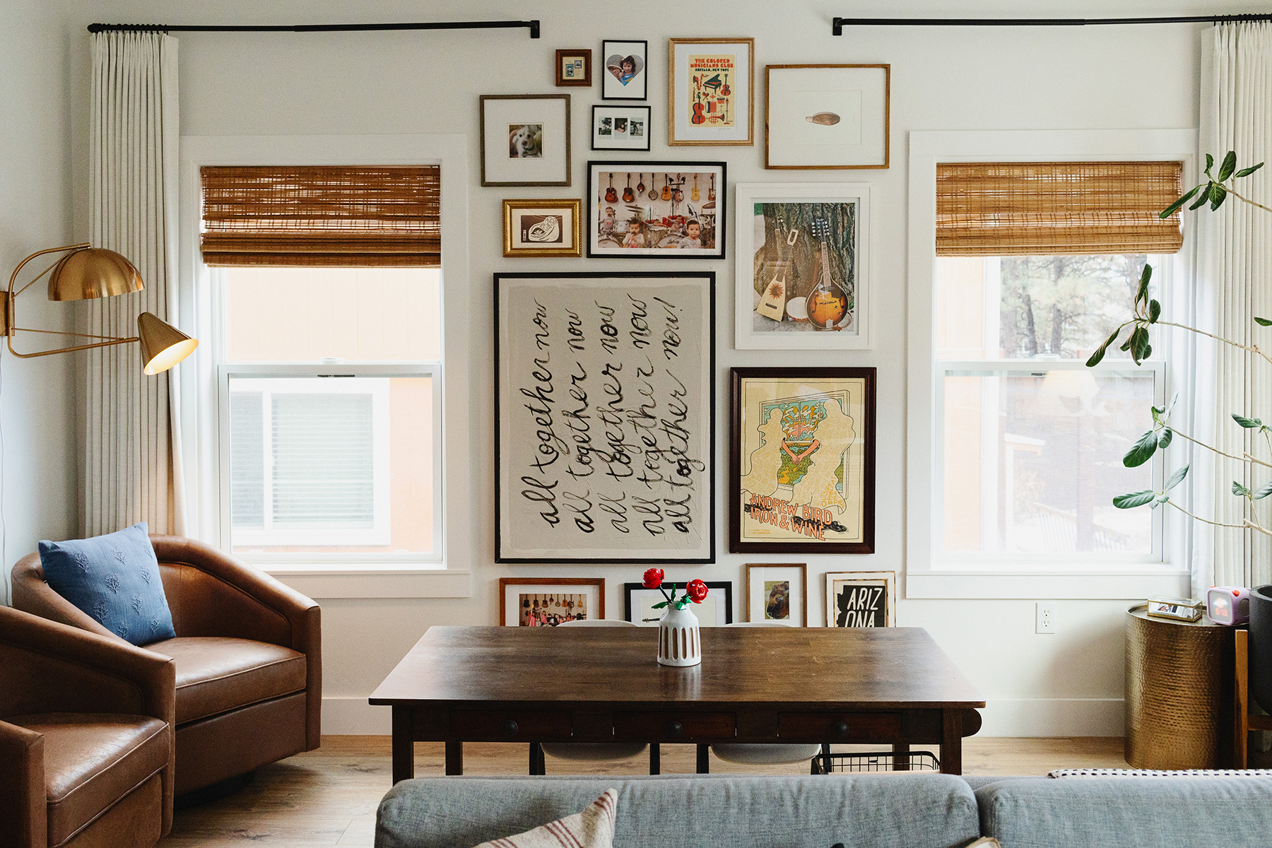
I had another brand partnership lined up where I needed to showcase the curtain panels, but needed to do something to make the photos more interesting. A couple of years ago I made this joint compound art piece and hung it between the windows. It was fine, but it was just there.
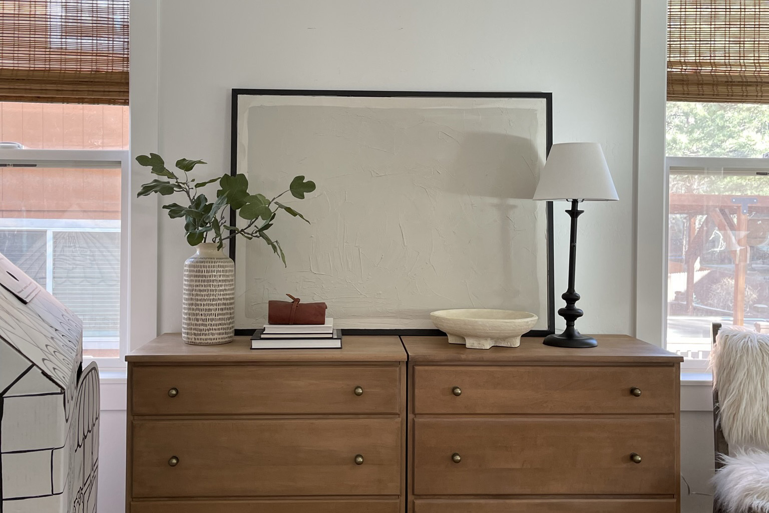
So I decided paint over it, adding the words “all together now” in cursive writing. I used my right hand (I’m left handed) to paint so that it would look less perfect and more organic. That phrase represents our home values of family first and being together, and of course, comes from one of our favorite bands.
After I painted that large focus piece, I went all in on making this a music/family themed gallery wall. I had been saving many of these prints for our future basement music studio renovation, but decided not to wait. Every single piece of art or photo tells a chapter of our story, and that’s why it feels so warm when I look at it.
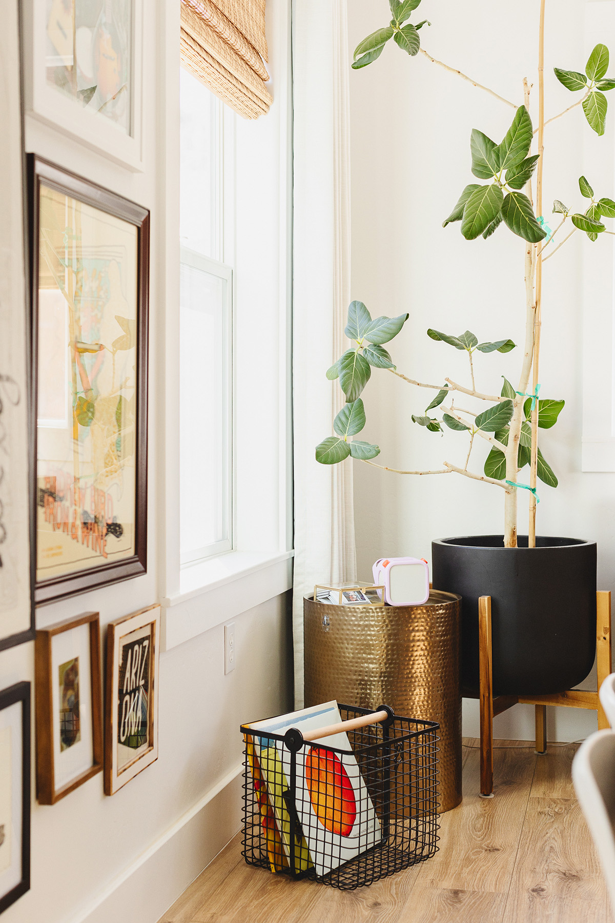
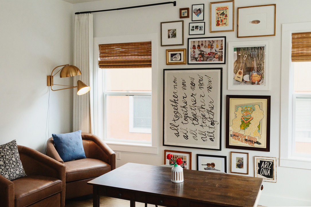
We brought down the swivel chairs from our bedroom nook, hung this multi-shape two-arm sconce that I’ve been hoarding forever (its plug-in!), and hung these stunning custom double tailored pleat drapes.
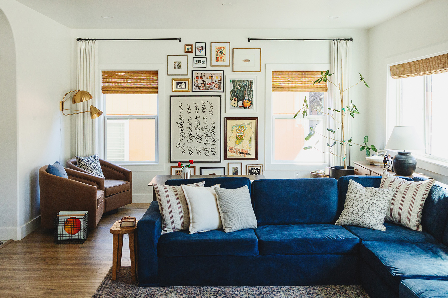
THEN! I got a custom slipcover made for our sectional in this gorgeous velvet blue fabric. It adds depth and contrast to the room and it’s the change that I’ve been craving in the sea of all neutrals. What’s also neat about this slipcover is that I chose a short skirt style, which changes the overall look and style of the sectional, hiding the sofa legs. Now it looks like a slipcovered sofa for a not-slipcovered sofa price.
One thing that I want to add to the space is a coffee table; however, the kids use this area to build forts and play with all kinds of things on the daily, so I might have to wait a bit longer before bursting that bubble. There’s another blank spot between the other two windows. Thinking maybe a mirror or something?
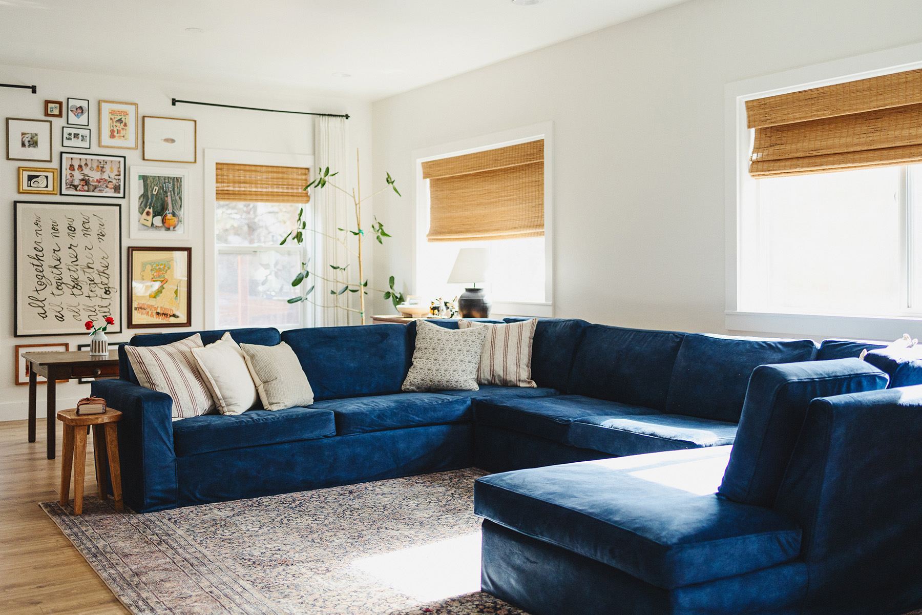
I hope you enjoyed the history of our living room. I’d love to hear your thoughts or suggestions on what to add. I have some other ideas coming, so expect me to share more of this space in the future.
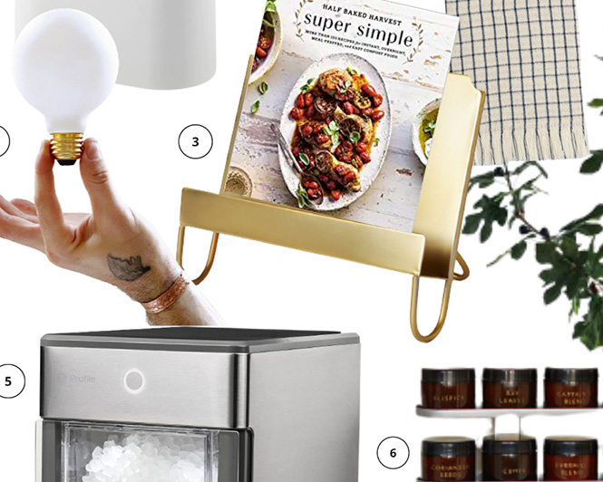
Shop the Post:
*Disclosure: This post may contain affiliate links. If you purchase a product, I may earn a small commission at no additional cost to you. Thank you for supporting my blog.

Hi, I’m Tiffany!
I’m so glad you’re here. I hope you’ll see this space as a source of inspiration and encouragement to take the first step in making your home a place you want to be, wherever that may be.
You can expect to find approachable DIY projects and tutorials, opinions on home design, and all the fun stuff that comes up in-between.
